Flexographic printing color consistency rarely breaks at one point. It erodes across several, and by the time a label comes off press looking slightly off, nobody can say for certain where the drift started. Was it the brand guide? The plate curve? The substrate? Usually it’s a combination, which is exactly why chasing color problems one press check at a time doesn’t work.
The fix isn’t a single tool or a single step. It’s treating color as a chain that runs from the brand standard all the way through to the press, where each link either holds the color steady or lets it slip.
Why Flexo Color Consistency Starts Before the Press Even Runs
Most color problems get blamed on the press, but the seeds are usually planted much earlier. A brand color guide built in a design tool, without any print production input, often looks perfect on screen and falls apart the moment it meets ink and substrate.
Pantone references and spot color libraries only protect flexo color consistency if they’re built with print in mind from the start. That means accounting for how a color behaves on corrugated versus film, and specifying tolerances instead of a single idealized value. A brand standard that says “this exact shade, no exceptions” sets up every print run after it to fail, because a small amount of variance is physically unavoidable with different substrates and ink systems.
National brand managers may have ΔE tolerances built in, which makes everything easier down the line, since everything downstream has something solid to measure against. But many brands are still eyeballing proofs.
Prepress and Plate Curves: Where Color Drift Begins
This is the stage where the beautiful poster, label, or package design that looked fine on a monitor starts adjusting to the reality of the printing process. ICC color profiles and calibrated plate curves exist to compensate for dot gain and substrate absorption before the job ever reaches a press operator.
If the wrong curve is applied to the plate during pre-press, then there’s no way the plate will be able to produce the colors. Your pressroom operators will be trying to adjust variables all day long during makeready and may still not get anywhere close to the proofs. Not only do you need to account for the substrate, plates, and tapes, but the prepress department must consider every piece of equipment on the press in that specific combination when applying the color curves. Press characterization is crucial.
In trying to save costs and meet deadlines, sometimes prepress will aim for “close enough.” They might use the profile from a previous run that uses mostly the same variables, but not that specific plate cylinder or sleeve. We’ve fielded many calls from pressroom operators trying to solve printing issues with a different tape (often the first swap pressroom operators try when colors aren’t matching), when the issue may be coming from an anilox roll, doctor blade, plate cylinder or sleeve, or even the ink itself. If prepress doesn’t account for all of these, it can set up the pressroom operators for a bad time.
A more common issue is a rerun using an old plate, but a different press. When the plate can’t be changed, the pressroom has to compensate for differences. There’s no simple fix here, apart from re-doing the plate. The long-term answer is having presses that are characterized to a common standard. That requires an investment in processes, and sometimes equipment, to get everything within certain tolerances.
It’s more complicated than saying that issues start in prepress, and sometimes the pressroom can truly be the source of a particular issue. A pressroom operator who needs to adjust ink viscosity to deal with dot gain can end up causing color problems by reducing the ink density. If the profile was built at a viscosity that’s difficult to hold in production, that’s a prepress and pressroom alignment problem from the start of the project, not something operators should be solving on the fly with adjustments that weren’t accounted for in the profile.
Proofing as a Checkpoint
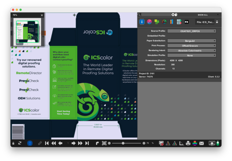
A proof is a client contract, guaranteeing a certain result on-press, and once it’s signed, that’s the target you need to hit. There are two kinds of proofs: hard (contract) proofs and soft (digital) proofs. Digital proofing can speed up the process and reduce costs, but it won’t show how a print job looks on the specific substrate; brand managers can’t hold it under different lighting, and it does require its own system for accurate color on the monitors. For first runs and high-stakes jobs, often hard proofs are still used. The paper they’re printed on can help simulate (though not replicate exactly) the final printing substrate.
On-Press Verification: Measuring Color Instead of Eyeballing It
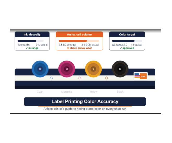
This is the step that separates shops with real flexo color consistency from shops that are guessing. A visual check tells you an opinion, and opinions vary by lighting, by monitor calibration, and by who’s standing at the press that day. A spectrophotometer reading tells you a number (ΔE), and it’s what serious printers use to check colors during makeready and spot check versus the run sheet during the actual press run.
ΔE measures the distance between a target color and what’s actually printing. It’s a fact of printing that you’ll never get the colors exactly right. Most flexo work holds up fine within a ΔE of 2, while anything past 4 or 5 starts becoming visible to an untrained eye, and definitely to a brand manager who knows exactly what their color is supposed to look like. Setting that tolerance ahead of time, and checking against it with a spectrophotometer rather than a gut feeling, turns “does this look right” into “does this meet spec.”
For converters working toward G7 calibration, this stage is where that standard gets applied in practice. It gives press operators a repeatable, numbers-based way to confirm gray balance and tone reproduction instead of relying on memory or habit.
None of this replaces a skilled press operator. It gives that operator something concrete to check against, instead of asking them to catch drift by eye on a run that’s already moving. The pressroom will always need to be checking accuracy, especially during long runs. Ink viscosity changes, presses heat up, and substrate batches change mid-run. Pressroom operators need to be constantly checking for drift, and have the knowledge needed to make adjustments.
The Chain Only Holds If Every Link Does
A perfectly built brand standard doesn’t help if the plate curve wasn’t calibrated for the substrate. A flawless proof doesn’t help if nobody checks the press against it with a spectrophotometer. Flexographic printing color consistency depends on every stage doing its job, not just the last one before the label ships.
If your shop is catching color problems at the press instead of before it, the fix usually isn’t a better press operator. It’s a closer look at what happened during pre-press and platemaking, and sometimes a look at your equipment, especially if you have wide variances between the character of one press versus another.
Book a consultation with A&V’s team to walk through where color is slipping in your workflow and what it would take to close the gap.